 文章
文章 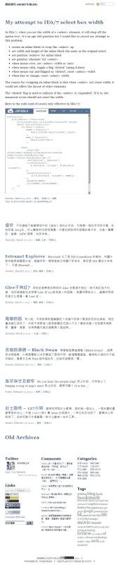
記得有朋友說過此 blog 的版面很「齋」,但事實上我其實覺得還未夠。一直想試這種 single column layout,沒有 sidebar,以文為本,很簡潔很專注的樣子。這種 layout 其實也很常見。
這版面是將原本的 veryplaintxt 改過來,用 wordpress 的 child-theme 去做,配上 Theme switch and preview plugin 去一路做一路試。(其實如果是由頭開始,用也是 veryplaintxt 內的 sandbox theme 會更好) 原來的 veryplaintxt 比較多使用 border,今次就全消去,盡量用空間做佈局,想沒有壓迫感。原來的 sidebar 變成 3 column bottom bar,再配 widgets 使用。字當然還是要大的,不過 comments 就用回小字了。comment form 也執過,用 placholder 省去 label。
結果就是大家看到的這個樣子了,覺得如何呢?
如果不知道換了layout,我會ReCSS一次,差點以為load不到CSS
說來慚愧, 平時都是rss sub你的blog,
所以對我影響不大, 但的確是很簡潔的設計, 很舒服
不用慚愧,用 rss 很正常,所以轉 layout 自爽成份居多。